
Technical Analysis Mastery: The Complete Guide for Stock Market Traders (2026)
Master technical analysis for stocks in 2026. Learn chart patterns, indicators, volume analysis, and pro strategies that intermediate traders use to find high-probability trades.
Introduction
Most traders study technical analysis. Very few actually master it.
You've read the basics. You know what a moving average is. You've drawn support and resistance lines. Maybe you've even placed a few trades using chart patterns — some worked, some didn't, and you're not entirely sure why.
That's the gap this guide closes.
Technical analysis for stock trading is not about memorizing 50 indicators. It's about learning to read what the market is actually doing — and responding with precision, not guesswork. In this complete guide, you'll learn how professional traders build a cohesive technical analysis system: from reading price structure and volume, to timing entries with indicators, to managing trades once you're in.
By the end, you'll have a repeatable framework — not a bag of tricks.
TL;DR — Key Takeaways
- Technical analysis works best when price action, volume, and indicators confirm each other
- Support and resistance are the foundation — every other tool builds on top of them
- No indicator works alone; confluence of 2–3 signals dramatically improves accuracy
- Volume confirms price moves — never ignore it
- The best technical traders spend more time managing trades than finding them
What Technical Analysis Actually Is (And What It Isn't)
Technical analysis is the study of past price and volume data to forecast future price direction. It operates on one core assumption: that all known information about a stock — earnings, news, sentiment — is already reflected in the price. Your job is to read that price.
What it is not: a magic formula, a guarantee, or a replacement for risk management.
Most intermediate traders fall into one of two traps:
Trap 1 — Indicator overload. Adding RSI, MACD, Bollinger Bands, Stochastic, and three moving averages to every chart. The result is paralysis — or worse, false confidence.
Trap 2 — Pattern obsession. Spotting a "head and shoulders" and blindly taking the trade without checking volume, trend context, or broader market conditions.
In practice, professional traders use a stripped-down, layered system. They start with price structure, confirm with volume, and use one or two indicators to time entries. That's the framework this guide teaches.
Part 1: The Foundation — Price Structure and Market Structure
Before any indicator, you need to understand market structure: the sequence of highs and lows that tells you whether a stock is trending, ranging, or reversing.
How to Read Market Structure
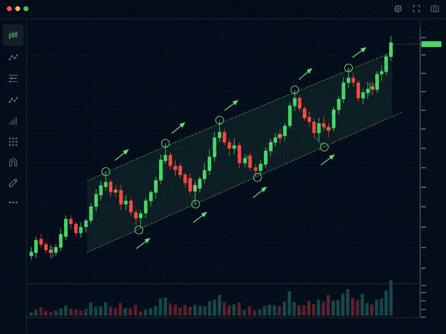
An uptrend is defined by higher highs (HH) and higher lows (HL). Each rally exceeds the previous peak. Each pullback holds above the previous low. As long as this pattern continues, the trend is intact.
A downtrend is the opposite — lower highs (LH) and lower lows (LL).
A range forms when price oscillates between two horizontal levels without making meaningful new highs or lows.
Why this matters: Every trade decision should be made relative to market structure. Buying a breakout in an uptrend is high probability. Buying a bounce in a downtrend is low probability. This distinction alone eliminates a large percentage of bad trades.
Pro Tip: Before placing any trade, ask yourself: "What is the market structure on the daily chart?" Then zoom into the 1-hour or 15-minute chart to time your entry. Higher timeframe structure always wins.
Support and Resistance — The Most Important Concept in Technical Analysis
Support is a price level where buying has historically been strong enough to stop a decline. Resistance is where selling has been strong enough to stop a rally.
These are not magic lines. They are areas where large numbers of traders have made decisions in the past — and where they're likely to make decisions again.
How to draw them correctly:
- Use the daily or weekly chart first
- Look for areas where price reversed multiple times — not just once
- Draw a zone, not a single line (price rarely bounces from the exact same price twice)
- The more times a level has been tested, the stronger it becomes
- When support breaks, it often becomes resistance — and vice versa
The most powerful support/resistance levels are:
- Round numbers ($50, $100, $200 — institutions cluster orders here)
- Prior all-time highs or lows
- 52-week highs and lows
- Levels that caused sharp reversals on high volume
Warning: Don't draw too many lines. If your chart looks like a spider web, you have too many levels. Focus on the 2–3 most significant zones and trade around those.
Part 2: Candlestick Patterns That Actually Matter
Candlestick charts are the standard for equity trading — and for good reason. They pack open, high, low, and close into a single visual unit, showing the battle between buyers and sellers in a given period.
At the intermediate level, you don't need 40 patterns. You need to deeply understand a handful of high-reliability setups.
The 6 Most Reliable Candlestick Patterns for Stock Traders
1. Hammer / Inverted Hammer A long lower wick with a small body near the top. Appears at the end of a downtrend. Signals that sellers pushed price down but buyers stepped in aggressively by the close. Most reliable when it forms at key support on above-average volume.
2. Shooting Star / Hanging Man The bearish equivalent of the hammer. A long upper wick, small body near the bottom. Shows buyers tried to push higher but sellers rejected the move. Most reliable at resistance levels.
3. Engulfing Patterns (Bullish & Bearish) A large candle that completely engulfs the prior candle's body. The most reliable of all reversal patterns — especially when the engulfing candle closes near its high (bullish) or low (bearish) on significant volume.
4. Doji A candle where open and close are nearly the same. Pure indecision. Alone it means little. At a key support or resistance level, after a strong trend, it signals potential exhaustion.
5. Inside Bar A candle whose high and low are completely within the previous candle's range. Signals consolidation and potential breakout. Trade the breakout of the inside bar in the direction of the larger trend.
6. Pin Bar (wide-ranging bar with long wick) Similar to a hammer or shooting star, but more extreme. The wick is at least 2/3 of the total candle length. One of the cleanest rejection signals in price action trading.
Pro Tip: A single candlestick pattern means very little. Two or three patterns appearing at the same key level — that's a signal worth trading.
Part 3: The Core Technical Indicators (Used Correctly)
Indicators are derived from price. They cannot predict the future — they can only help you contextualize what price is already doing. Used correctly, they improve timing. Used incorrectly, they add confusion.
Moving Averages — Trend Identification
The Simple Moving Average (SMA) and Exponential Moving Average (EMA) smooth out price action to show direction.
The most-used settings for stock trading:
| Moving Average | Use Case |
|---|---|
| 20 EMA | Short-term trend direction, dynamic support |
| 50 SMA | Intermediate trend, widely watched by institutions |
| 200 SMA | Long-term trend — the line between bull and bear |
The golden rule of moving averages: Don't trade against the 200 SMA unless you have very strong reasons. Stocks trading above the 200 SMA are in long-term uptrends. Below it — proceed with extreme caution on long trades.
The moving average crossover (when the 50 SMA crosses above or below the 200 SMA) — the so-called "golden cross" and "death cross" — gets a lot of attention. Use it for context, not as a direct trade signal. By the time the crossover happens, the trend has often already moved significantly.
RSI — Momentum and Divergence
The Relative Strength Index (RSI) measures the speed and magnitude of recent price changes on a scale of 0–100.
Most beginners use it wrong — selling every time RSI hits 70, buying every time it hits 30. In a strong uptrend, RSI can stay above 70 for weeks.
How intermediate traders use RSI:
RSI Divergence is the most powerful RSI signal. It occurs when:
- Price makes a new high, but RSI makes a lower high — bearish divergence (momentum weakening)
- Price makes a new low, but RSI makes a higher low — bullish divergence (selling pressure fading)
Divergence doesn't guarantee reversal. It signals that momentum is weakening — and when combined with a key support/resistance level, it becomes a high-probability trade setup.
Best RSI settings for stocks: 14-period on the daily chart is standard. For swing trading, some traders use 9-period for faster signals.
MACD — Trend and Momentum Confirmation
The Moving Average Convergence Divergence (MACD) shows the relationship between two EMAs (typically 12 and 26), with a signal line (9 EMA of the MACD).
How to use it:
- MACD crossing above signal line — bullish momentum building
- MACD crossing below signal line — bearish momentum building
- MACD histogram shrinking — current trend losing momentum
- MACD divergence (same concept as RSI divergence) — potential reversal
Pro Tip: MACD and RSI together are redundant — both measure momentum. Use one momentum indicator (RSI or MACD) combined with a trend tool (moving averages) and volume. That's a complete, non-redundant indicator setup.
Bollinger Bands — Volatility and Mean Reversion
Bollinger Bands consist of a 20 SMA with two bands set 2 standard deviations above and below. They expand during high volatility and contract during low volatility.
The Bollinger Band squeeze is the most actionable setup: when the bands narrow significantly (low volatility), a large directional move is coming. The squeeze itself doesn't tell you direction — price action and volume do.
The mean reversion trade: In ranging markets, when price touches the upper band and a bearish candlestick forms, it often reverts to the middle band. Same logic applies to the lower band. This fails in strong trending markets — don't fight momentum with mean reversion.
Part 4: Volume Analysis — The Confirmation Tool Most Traders Ignore
Here's what separates intermediate traders from advanced traders: volume analysis.
Price tells you what is happening. Volume tells you who is behind it — retail traders or institutions.
The Core Volume Principles
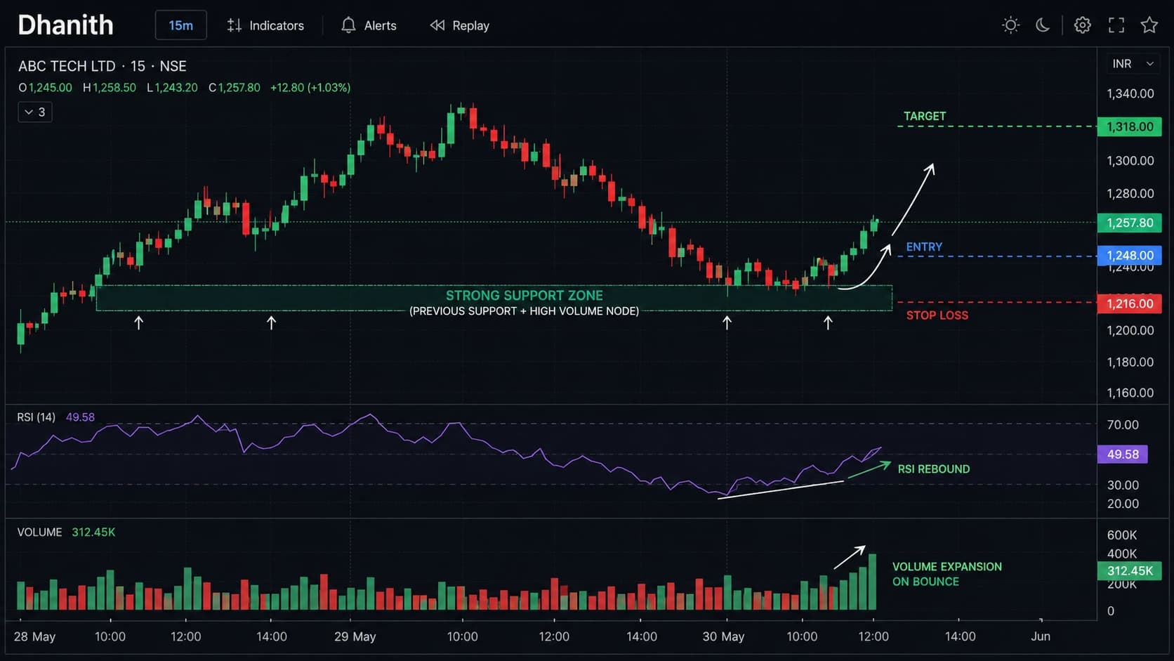
1. Volume confirms breakouts. A stock breaks above a key resistance level. If volume is 2x or more the average — institutions are buying. The breakout is likely real. If volume is below average on the breakout — it's likely a false move. Wait for a retest.
2. Rising price + rising volume = healthy trend. The trend has fuel behind it. Continue holding or adding to positions.
3. Rising price + falling volume = weakening trend. The move is running out of buyers. Don't add to positions. Tighten your stop.
4. High volume at a reversal level = strong signal. When price hits support and a bullish candle forms on the highest volume in weeks — that's institutional accumulation. This is the exact spot experienced traders are looking to enter.
5. Climax volume = potential reversal. A massive volume spike (3x–5x average) often marks exhaustion — sellers giving up in a downtrend, or buyers running out of firepower in an uptrend. These often mark short-term tops and bottoms.
Warning: Volume data on pre-market and after-hours moves is often misleading — thin markets create exaggerated moves. Focus on volume during regular trading hours (9:30 AM – 4:00 PM ET).
Part 5: Chart Patterns — High-Probability Setups
Chart patterns are visual formations that suggest future price direction based on the psychology of buyers and sellers. At the intermediate level, focus on patterns with the highest historical reliability.
Continuation Patterns (Trade with the Trend)
Bull Flag After a sharp upward move (the "flagpole"), price consolidates in a tight, slightly downward channel (the "flag"). The breakout of the upper flag boundary, on high volume, signals continuation. One of the cleanest, most reliable patterns in stock trading.
Ascending Triangle Flat resistance line at the top, rising lows at the bottom. Buyers are gradually becoming more aggressive. Breakout above resistance on volume is the entry signal.
Cup and Handle A longer-term pattern (weeks to months). Price forms a rounded bottom (the cup), then a short consolidation (the handle), then breaks out. Most effective on the weekly chart for swing trades.
Reversal Patterns (Trend Change Signals)
Head and Shoulders Three peaks: a lower left shoulder, a higher head, and a lower right shoulder. The "neckline" connects the lows between the peaks. A confirmed breakdown below the neckline — on volume — is the entry signal for a short trade (or exit signal for longs).
Double Top / Double Bottom Price tests the same level twice and fails (double top) or tests the same support twice and holds (double bottom). Simple but effective. The more time between the two tests, the more significant the pattern.
Falling Wedge (Bullish Reversal) Price makes lower highs and lower lows, but the lows are falling faster than the highs — creating a converging wedge shape pointing down. Despite the downward appearance, this is typically a bullish pattern. Breakout above the upper trendline is the signal.
Part 6: Building a Complete Technical Analysis System
Individual tools are just tools. What makes a trader profitable is how they combine them into a consistent, rules-based system.
The Confluence Framework
Confluence means multiple independent signals pointing in the same direction at the same time. The more factors that align, the higher the probability of the trade.
A high-confluence long setup looks like this:
- ✅ Stock is above the 200 SMA (long-term uptrend)
- ✅ Price pulls back to a significant support zone
- ✅ A bullish engulfing or hammer forms at that support
- ✅ RSI shows bullish divergence at the support level
- ✅ Volume spikes on the reversal candle
- ✅ Risk/reward is at least 2:1 (target is 2x the distance to your stop)
When all six factors align — that's a trade worth taking. When only two or three align — pass and wait for a better setup.
Pro Tip: Keep a setup checklist. Before entering any trade, physically check off each factor. If you can't check at least 4 of 6 boxes, don't take the trade. Discipline is the difference between a system and gambling.
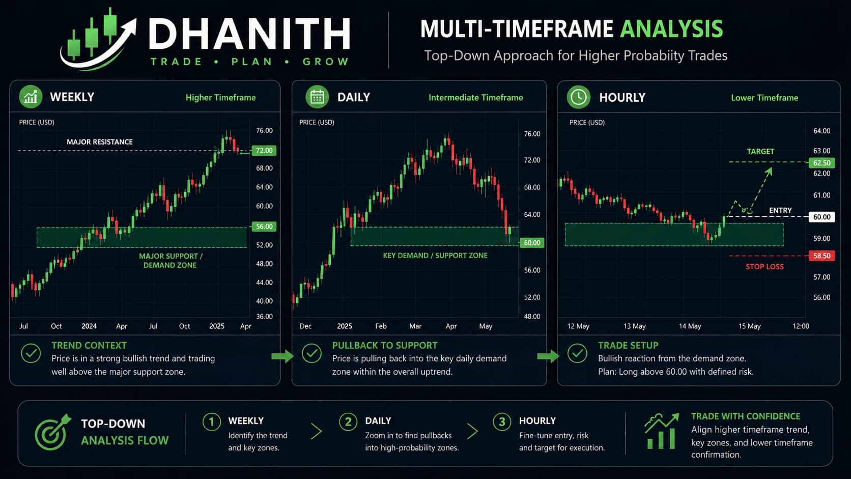
Timeframe Alignment
One of the most underused techniques in technical analysis is multi-timeframe analysis (MTF).
The principle: use a higher timeframe to determine the direction and key levels, then zoom into a lower timeframe to time the entry.
| Timeframe | Purpose |
|---|---|
| Weekly | Overall trend direction and major S/R zones |
| Daily | Setup identification and key levels |
| 4-Hour | Entry timing and pattern confirmation |
| 1-Hour | Fine-tuning entry and stop placement |
The rule: Never fight the daily or weekly trend on a short-term timeframe. If the daily is bearish, don't buy a bullish 15-minute signal. Trade in the direction of the higher timeframe — always.
Entry, Stop Loss, and Target Rules
A complete trade has three components before you enter:
Entry: At the confluence zone — after confirmation (a candle close, not just a wick touch)
Stop Loss: Below the key support level (for longs) or above key resistance (for shorts). Set it where your analysis is wrong — not where you're comfortable losing.
Target: Defined before entry. Minimum 2:1 reward-to-risk ratio. Use the next significant resistance level (for longs) or support level (for shorts) as your target.
Warning: Moving your stop loss further away when a trade goes against you is the single most destructive habit in trading. If price reaches your stop, your analysis was wrong. Accept it and move on.
Part 7: Common Technical Analysis Mistakes Intermediate Traders Make
1. Confirmation bias You decide you want to buy a stock, then find technical reasons to justify it. The chart should tell you what to do — not confirm what you already want to do.
2. Ignoring the broader market A technically perfect bullish setup in a stock means little if the S&P 500 is in a confirmed downtrend. The tide moves all boats. Check the index first.
3. Chasing breakouts without volume A breakout without volume is a trap. Price can temporarily breach a level with light buying before snapping back. Always wait for a volume-confirmed breakout — or better yet, wait for a retest of the breakout level.
4. Over-optimizing indicators Changing RSI settings from 14 to 12 because backtesting showed better results. This is curve-fitting — the settings worked in the past because you designed them to. They won't necessarily work going forward.
5. Treating technical analysis as standalone Technical analysis tells you when to trade. Earnings calendars, sector strength, and macro conditions tell you what to trade. Ignoring fundamentals entirely is like driving with one eye closed.
FAQ
Q: Is technical analysis reliable for stock trading? Technical analysis is a probabilistic tool, not a predictive one. When used with proper risk management and confluence-based setups, it significantly improves the consistency of trade timing. No method works 100% of the time — the goal is to put the odds in your favor consistently.
Q: What is the best technical indicator for stocks? There is no single best indicator. The most effective setups combine a trend tool (moving averages), a momentum tool (RSI or MACD), and volume. These three categories cover trend, timing, and confirmation — the core elements of any trade decision.
Q: How long does it take to master technical analysis? Most traders need 1–2 years of active chart study combined with real trading experience to develop genuine competence. Mastery — where pattern recognition becomes intuitive — typically takes 3–5 years of consistent practice and journaling.
Q: Can technical analysis be used for day trading and swing trading? Yes — the same concepts apply across timeframes. Day traders use 1-minute to 15-minute charts. Swing traders use daily and weekly charts. The principles of support, resistance, trend, volume, and confluence work identically at every timeframe.
Q: What charts should I use to learn technical analysis? TradingView is the industry standard for stock chart analysis. It's free at the basic level and used by professional and retail traders globally. For options and deeper analysis, thinkorswim (TD Ameritrade/Schwab) is the gold standard.
Conclusion
Technical analysis mastery is not about knowing more indicators. It's about understanding fewer tools more deeply — and combining them into a system you execute with discipline every single time.
The framework in this guide gives you everything you need:
- Read market structure first — know the trend before anything else
- Build setups around confluence — the more factors align, the better the trade
- Use volume to confirm everything — it separates real moves from noise
The traders who succeed long-term are not the ones who found the perfect indicator. They're the ones who built a clear system, traded it consistently, and cut losses without hesitation.
Start with one pattern. Master it. Add one indicator. Understand it completely. Build from there.
Related Articles
- Smart Money Concepts: The Complete Mastery Guide — How institutional traders use a more advanced price action framework that explains why your support and resistance levels actually work
- SMC Market Structure: BOS, CHoCH and Strong vs Weak Levels — A deeper look at market structure that goes beyond higher highs and lower lows to identify which levels will hold under pressure
- Order Blocks: The Complete Mastery Guide — The institutional explanation for support and resistance zones — why certain levels produce sharp, reliable reactions
- Fair Value Gaps: The Complete Mastery Guide — Price imbalances created by institutional order flow that predict high-probability retracement entries
- Liquidity Sweeps: The Complete Mastery Guide — Why "false breakouts" happen and how to anticipate them rather than be trapped by them
- Accumulation, Manipulation, Distribution (AMD Cycle) — The three-phase daily cycle that explains the opening 30-minute spike behavior most traders experience
Disclaimer: Technical analysis and trading involve significant risk of loss. This guide is for educational purposes only and does not constitute financial or investment advice. Always use proper risk management and only trade with capital you can afford to lose.
Continue Reading

